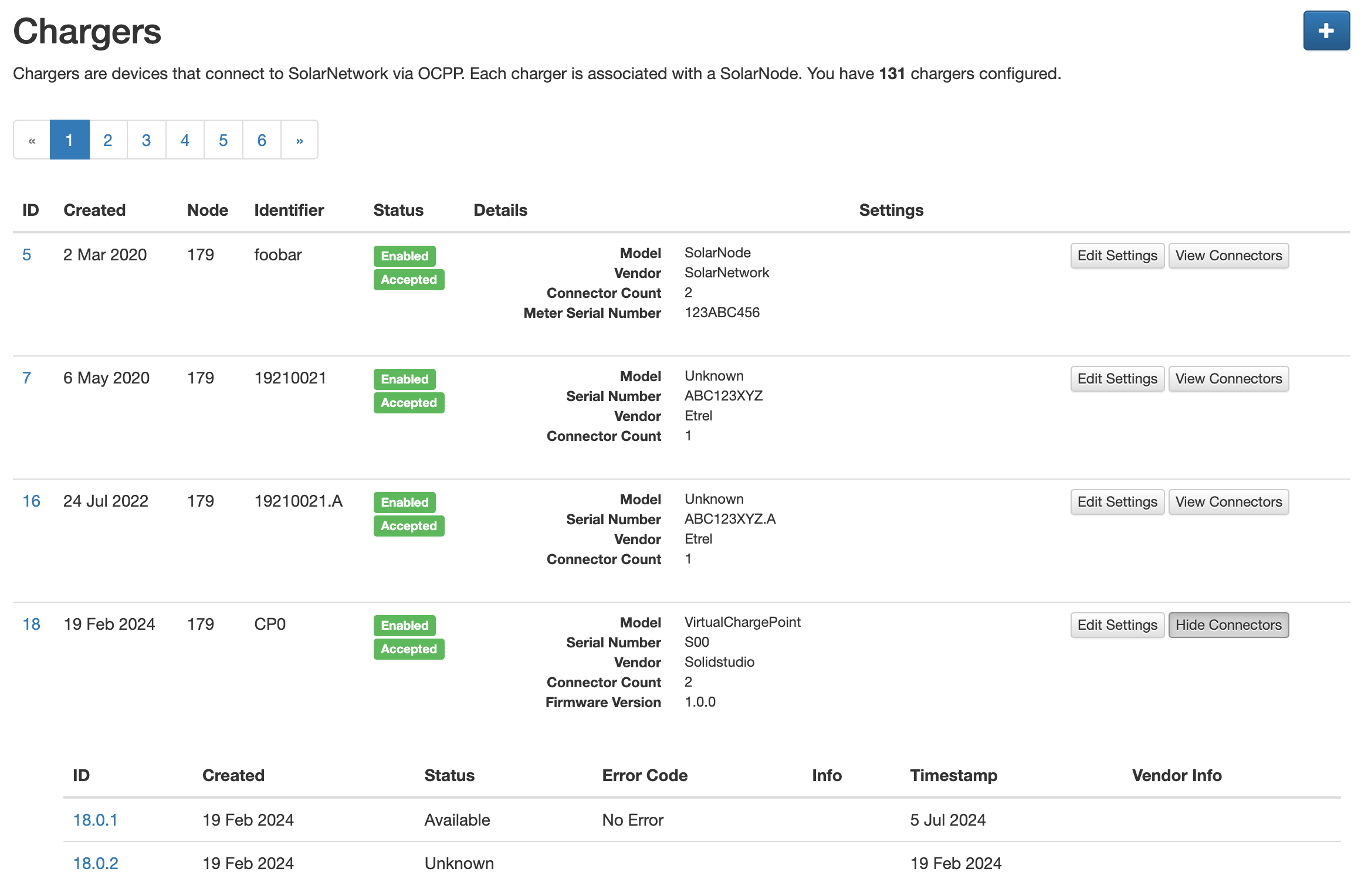
As the number of OCPP chargers/connectors grows within an account, the SolarUser OCPP management UI becomes unwieldy as it loads all chargers and all connectors into one long page.
It would be useful to break up the shown chargers into pages, and offer pagination buttons to "scroll" between pages. Then, do not show connector details except as a "Show Connectors" button associated with each charger. That way the connector information does not even have to load unless requested explicitly.