Better area chart curve handling of separated data

XMLWordPrintable

    • Type: Improvement
    • Resolution: Fixed
    • Priority: Minor
    • Component/s: Charting
    • None

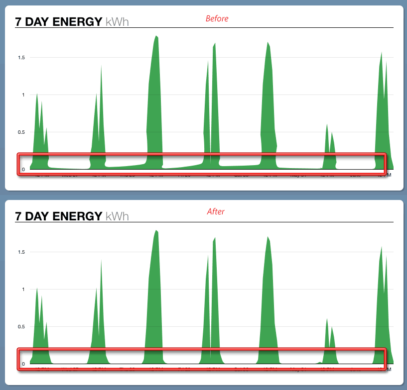
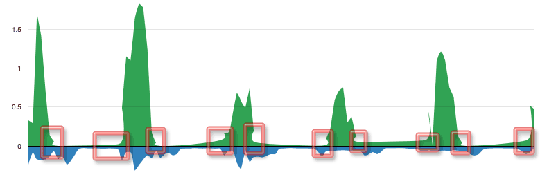
      The default interpolation of the area charts causes data streams with discrete ranges of points to draw inappropriately rendered curves at the start/end of the data ranges. See the highlighted areas of this sample chart:

      Ideally the data values would implicitly be set to zero at the x-axis point immediately proceeding or following each discrete range of points.

        1. area-chart-interpolation-improvement.png
          20 kB
          Matt Magoffin
        2. bad-curves.png
          8 kB
          Matt Magoffin

            Assignee:
            Matt Magoffin
            Reporter:
            Matt Magoffin
            Votes:
            0 Vote for this issue
            Watchers:
            1 Start watching this issue

              Created:
              Updated:
              Resolved: